




Covid-19's Impact on Traffic Congestion
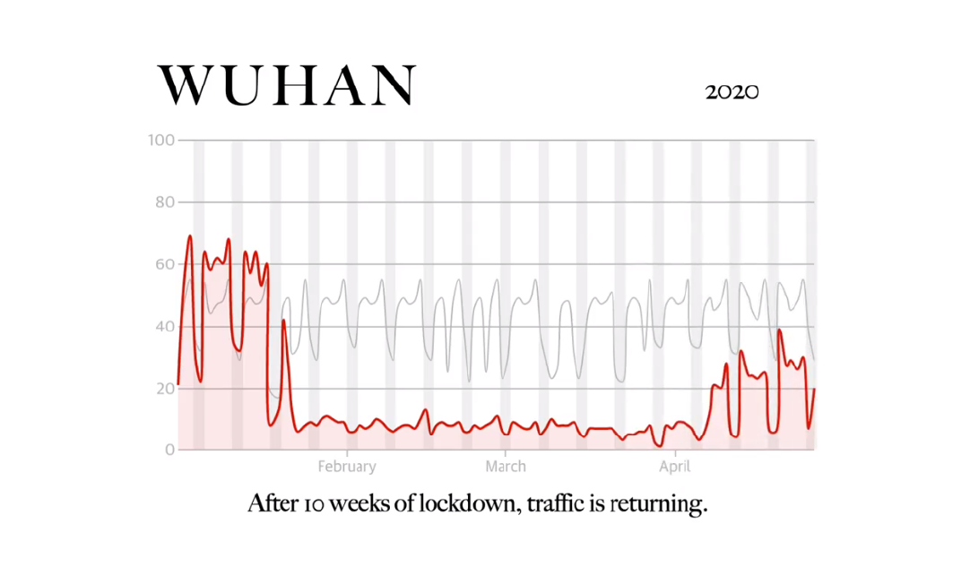
The amount of human movement has changed during the pandemic. This visualization portrays the data gathered by the 'TomTom Traffic Index', comparing the amount of traffic in 2019 and now of selected major cities and hotspots.
Worldwide map of lockdown severity; June 1-7 2020
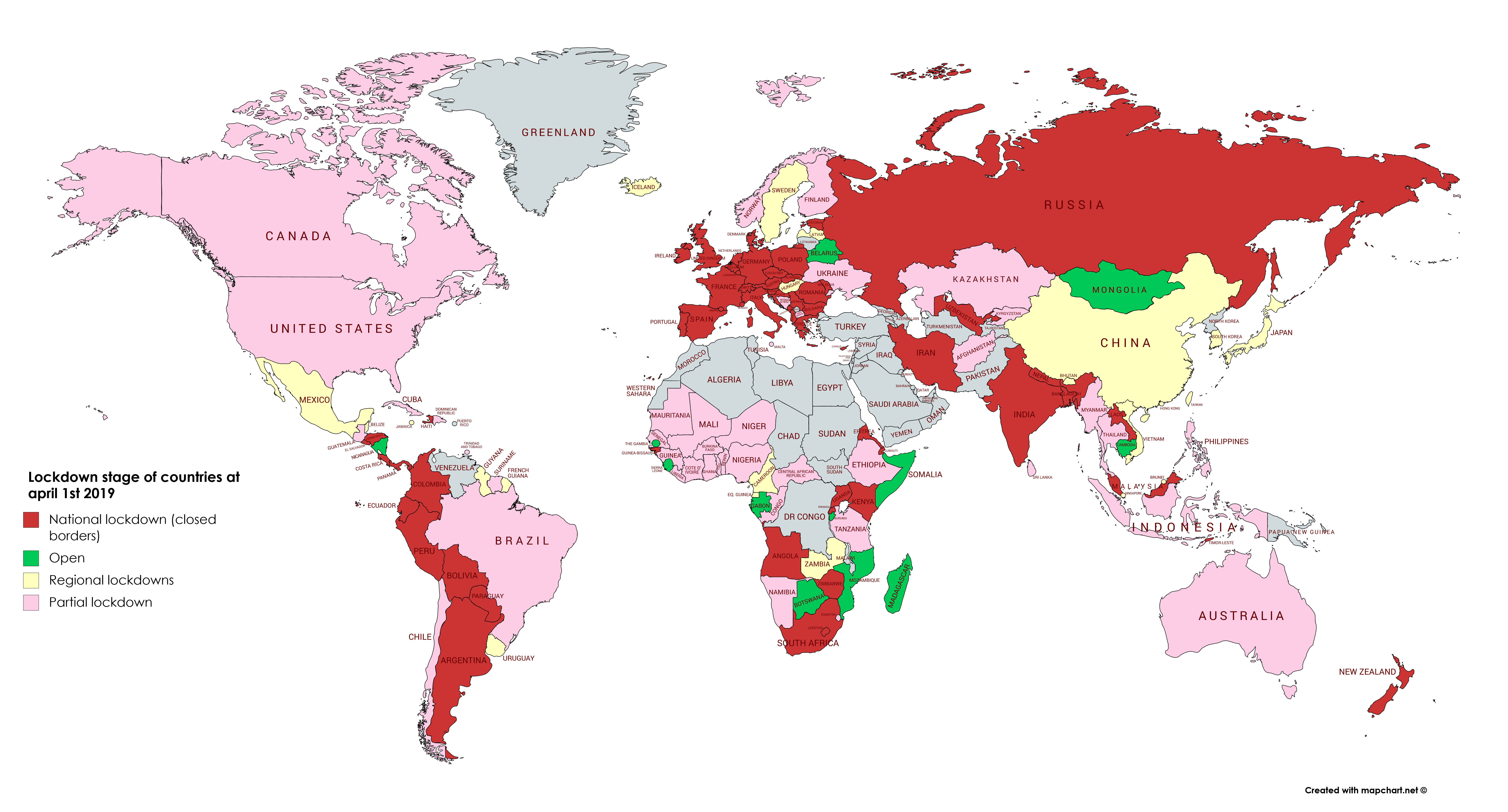
The borders of the world continue to change lockdown state during this pandemic. This visualisation shows the recent state of lockdown according to data from covidtracker.
Covid-19's Impact on International Borders
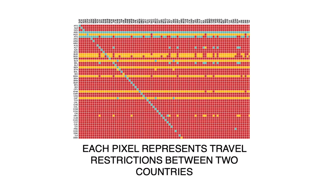
Travel restrictions were hard and sudden during the pandemic. This visualizations portrays data gather by the 'International Organization for Migration': showing travel relationships between countries over a period of 60 days. On March 9th the heatmap shows fairly open relations, the opposite is true now; how did we get here?
Number of cases vs mobility trends in Europe (mid-April)
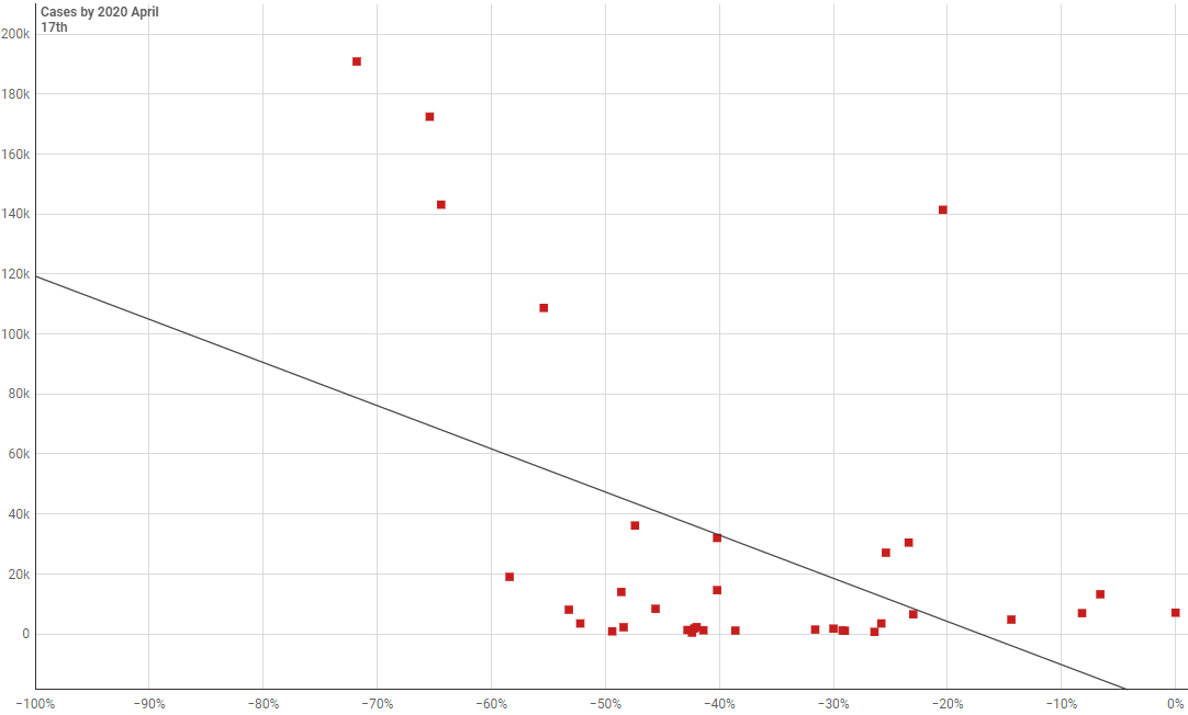
Horizontal axis: Mobility changes in European countries by 2020 April 17th, relative to the usual activity of this period of the year (based on the data of previous years) Vertical axis: Confirmed cases of COVID-19 in European countries by 2020 April 17th.
Downward trajectory of documented cases within a 14-day period (April 23th-May 7th)
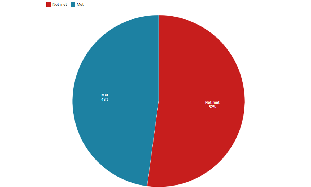
President Trump published guidelines for reopening US states this spring. Amongst these guidelines, the "downward trajectory of documented cases within a 14-day period" criterion can be found, which was applied in the chart above to every state with available data in the world.